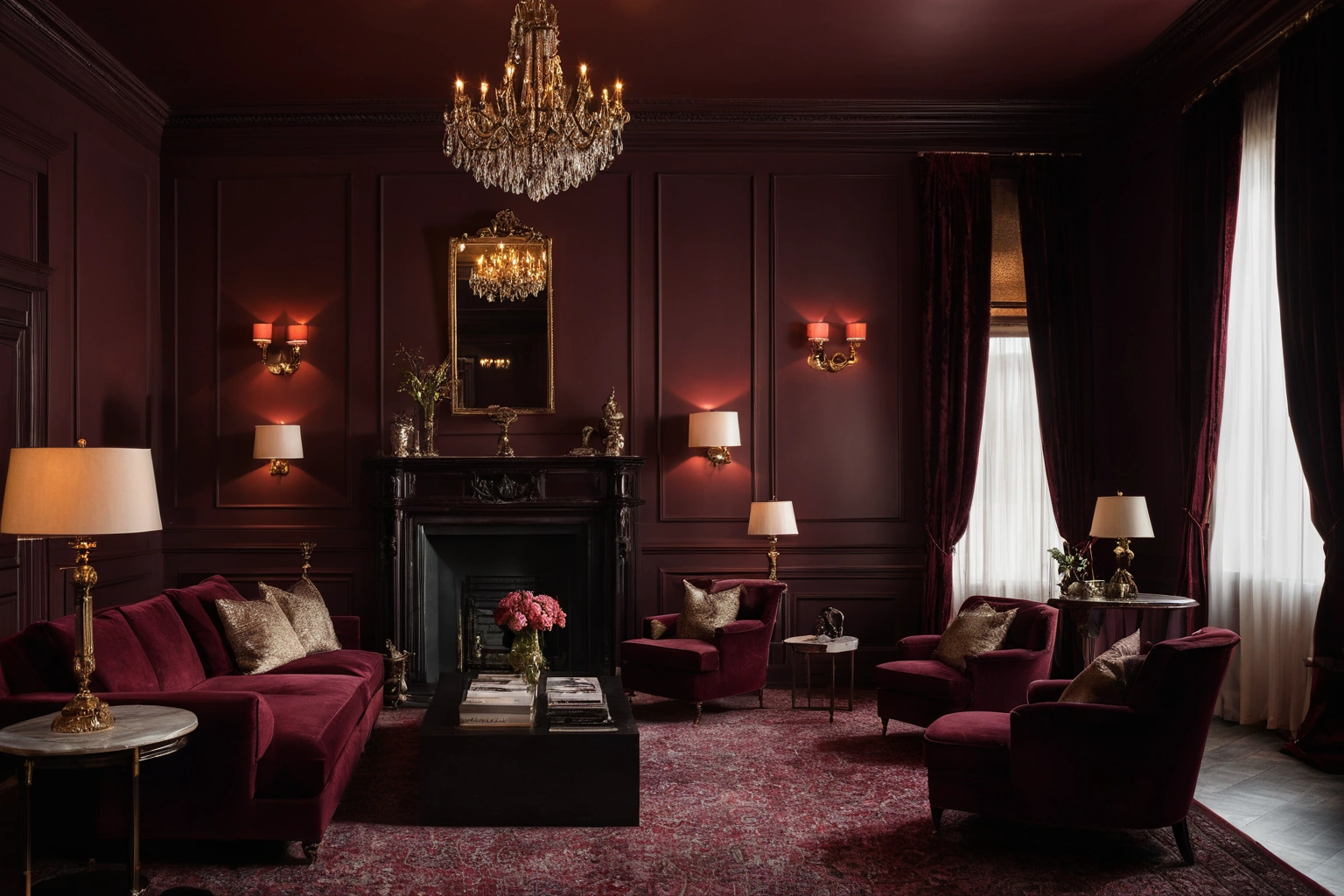
Patina Blue and Oxblood: Reading the 2026 Mineral Palette in Real Light
Patina Blue and Oxblood: Reading the 2026 Mineral Palette in Real Light
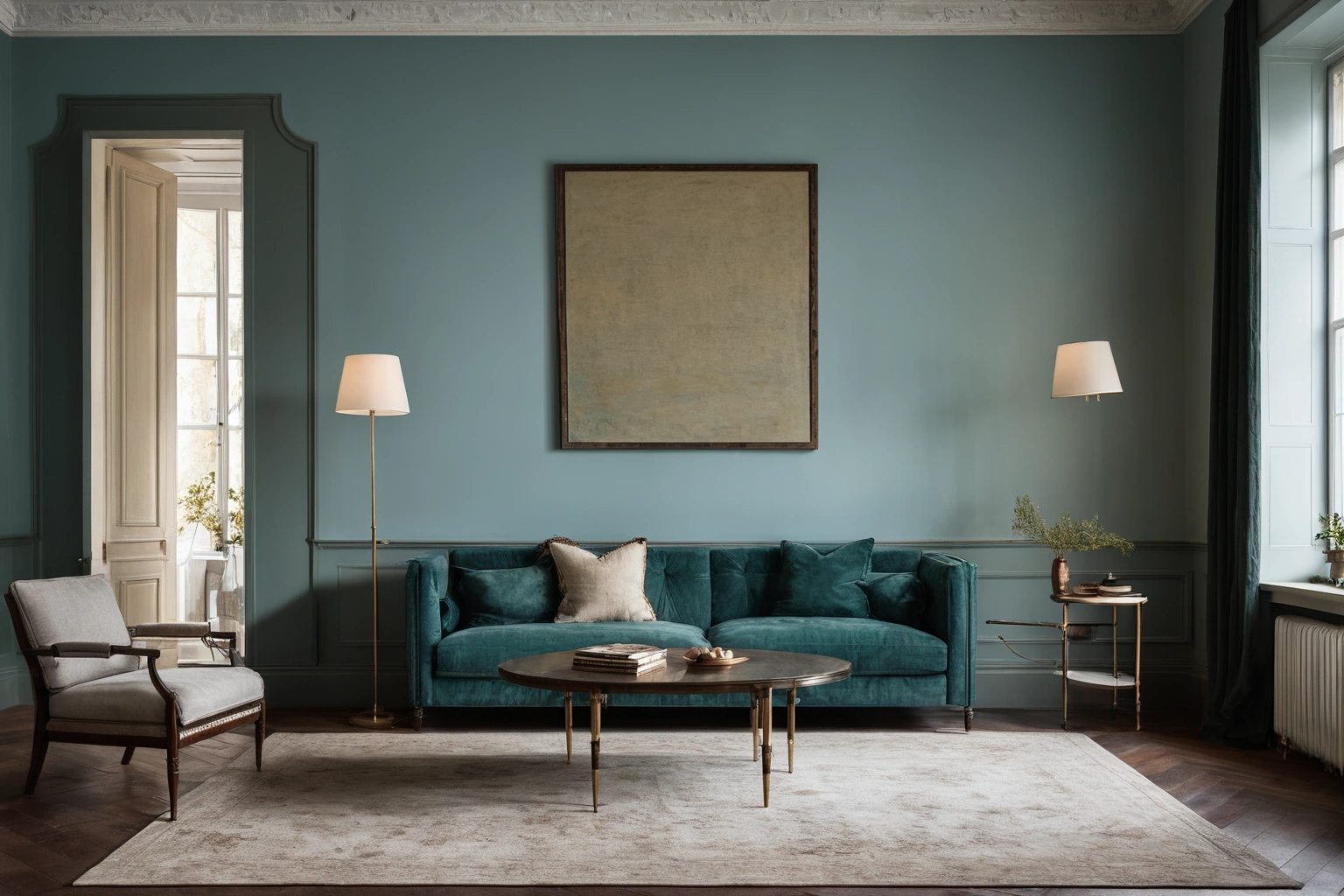
For readers assessing Italian interior design, the practical question is how the idea performs in a real room, not only how it photographs. Etsy named Patina Blue its colour of the year for 2026, a quietly saturated blue-green taken from the way copper ages, backed by its own marketplace data: searches for “blue copper” had climbed more than threefold over the previous year. The paint brands landed in the same register. Benjamin Moore chose Silhouette, burnt umber cut with charcoal; C2 chose Epernay, a soft ochre with muted mineral undertones; Behr chose Hidden Gem, a smoky jade between green and blue. The wider forecast keeps naming clay, oxblood, deep blue, warm neutrals. It is a palette built for the turn away from minimalism, and it will betray you if you pick it off a swatch card under showroom light.
What “mineral” actually specifies
The word points at where these colours come from: oxide, ore, weathered metal. Copper patina is not one substance. The green-blue crust on an old roof is a mixture of copper carbonates, sulfates, sulfides and chlorides, and the proportions depend on the air it grew in. Clean air pushes it toward basic copper carbonate; acid rain pushes it toward sulfates. The colour is a range, not a value, which is why no two copper roofs match.
Oxblood has the same ancestry. It is a dark maroon, one of the darkest reds, close to burgundy but with less purple and more brown. The name is literal: ox blood was a pigment for fabric, leather and paint, and it darkened toward a browner red as it oxidised. Both are named after ageing, and both carry their character in undertones rather than the dominant hue. That is the family that misbehaves when light changes.
A colour is two spectra multiplied
What you see is the lamp’s output multiplied by the surface’s reflectance, wavelength by wavelength. A pigment cannot reflect energy the lamp never emitted. On the standard colour temperature scale a candle flame sits near 1,850 K, a tungsten lamp around 2,400 K, a soft-white lamp about 2,550 K, horizon daylight about 5,000 K and overcast daylight about 6,500 K. Between your evening lamp and your midday window lies roughly 4,000 K of shifted spectral weight. A related practical reference is available in Luxury Lighting Design in Dubai Villas: Circadian Scenes, Backlit Onyx, and Concealed Control.
Orientation sets the baseline. North light never arrives direct from the sun; it is sky, scattered by nitrogen and oxygen, and Rayleigh scattering favours the short wavelengths. So it is bluer, and it does not change colour through the day. Painters built studios around that fact. A south or west room swings thousands of Kelvin between noon and sunset, dragging every colour with it.
| Light | Approx. CCT | Patina blue | Oxblood |
|---|---|---|---|
| North sky, all day | ~6,500 K | Reinforced; tips cold | Flattens toward brown |
| South/west sun, afternoon | 5,000 K falling | Warms and greens | Gains depth as light reddens |
| Tungsten / soft white lamp | 2,400–2,550 K | Starved of short wavelengths; reads grey | Reads richest here |
| Candle | ~1,850 K | Effectively dead as a blue | Deepens to near-black red |
Why the showroom lies
The mechanism has a name. Metamerism is when two surfaces match under one illuminant and separate under another, because their spectral reflectance curves differ even where their measured colour agreed. A paint and a velvet chosen together under a shop’s track lighting have made no promise about your north-facing sitting room. The colours most prone to it are the muted ones: taupes, mauves, greys, grey-blues, celadons. That is the 2026 palette. This decision can also be compared with the site’s guide to Preparing an Interior Design Brief for SGCI: What to Decide Before the First Meeting.
A swatch card is a claim about pigment. A room is a claim about light. The two agree only by accident, and the accident is what people call “it looked different in the shop.”
Lamp quality decides how badly this bites. CRI scores a source from 0 to 100, but the general index Ra averages just eight low-saturation test colours from CIE 13.3 (1995), and its colour space is obsolete. A lamp can post a respectable Ra and still hollow out a saturated red, because no saturated red is in the test set. The IES introduced TM-30 in 2015 to fix that: 99 samples, a fidelity index Rf and a gamut index Rg. Rg above 100 means the lamp saturates, below 100 means it dulls. For an oxblood room that is the number that matters, and almost nobody asks for it.

Sheen is a saturation control, and it is free
Pigment is only half of what the eye reads. In a 2020 study in Frontiers in Psychology, Honson and colleagues found that perceived saturation fell as specular roughness rose, while perceived lightness went up. The explanation is mechanical: when a highlight has blurred edges, the visual system cannot separate the specular reflection from the diffuse shading beneath it, so it charges the reflected white to the surface’s own colour. Their model accounted for 72 to 94 percent of the variation. The wider project context is available from sgci.ae.
In a room, matte scatters light back and lays a thin white veil over the pigment, so the colour reads lighter and duller. Gloss concentrates the reflection into a highlight you can look past, and everything either side of it reads deeper. The same oxblood in flat emulsion, eggshell and polished lacquer is three colours, and you paid the same for all three. Matte velvet holds saturation that slubby linen in the identical dye lot gives away.
- Correlated colour temperature (CCT)
- How warm or cool a white light looks, in kelvins. Appearance, not spectrum.
- Spectral reflectance
- The light a surface returns at each wavelength. Two colours can match without sharing one.
- Metamerism
- A match that holds under one light and fails under another.
- Ra (CRI)
- An average fidelity score over eight desaturated test colours. Silent about saturated hues.
- Rf and Rg (TM-30)
- Fidelity and gamut across 99 samples. Rg says whether a lamp saturates or dulls.

Testing it properly
- Sample big. Two coats on a board of at least A2, not a 50 mm chip. A small patch is overwhelmed by whatever surrounds it.
- Move the board. Every wall gets different light. Stand it against each one, including the darkest corner, and judge it against the floor, stone and textiles it must sit with, never bare plaster.
- Look three times. Morning, midday, and after dark under the lamps you own. If the room is used at night, decide at night.
- Fix the lamps first. Lighting is a larger variable than the paint’s undertone.
- Choose sheen after hue. Once the colour is settled, sample it again in two finishes.
What to ask before you commit
At the commissioning end, colour becomes a specification with a delivery date. A workshop producing made-to-order interiors should answer all of this without reaching for a brochure. Further related coverage is collected in Blog.
- Were the paint, the fabric and the veneer approved under the same illuminant?
- What are the lamps in the scheme, and their CCT and Rg, not just Ra?
- Which way does the room face, and was the colour signed off in that orientation’s light?
- Is sheen specified per surface, or is one finish going on the whole room by default?
- Are dye lot and batch recorded, so a later addition matches the first delivery?

The 2026 palette is a good one. It is warmer than the greys it replaces, it forgives wear, and it was chosen by people watching what buyers search for, not what looks decisive on a mood board. But its colours carry their identity in their undertones, and undertones are the first thing a light source takes away. Patina blue wants a room that stays bright and cool. Oxblood wants lamplight and a low sun. Put either in the wrong room and you get a dead colour, and you blame the paint.